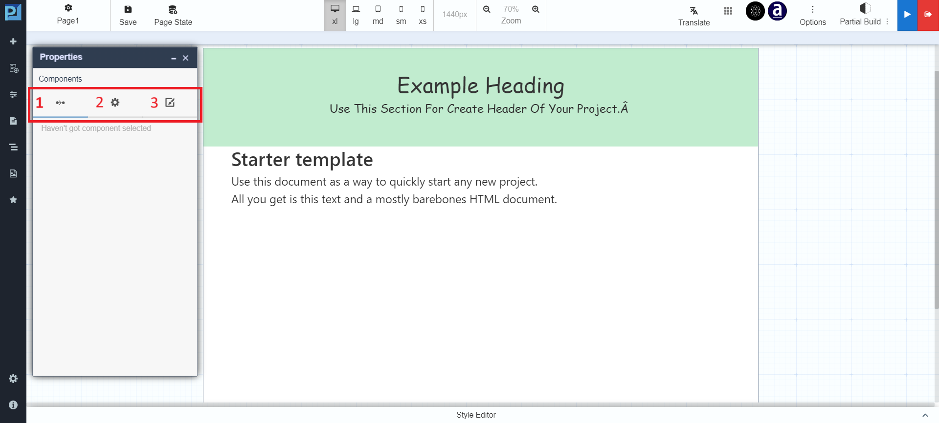
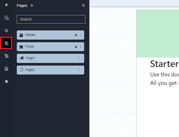
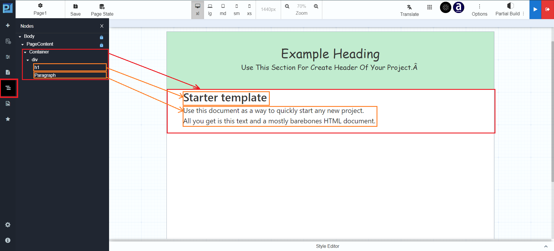
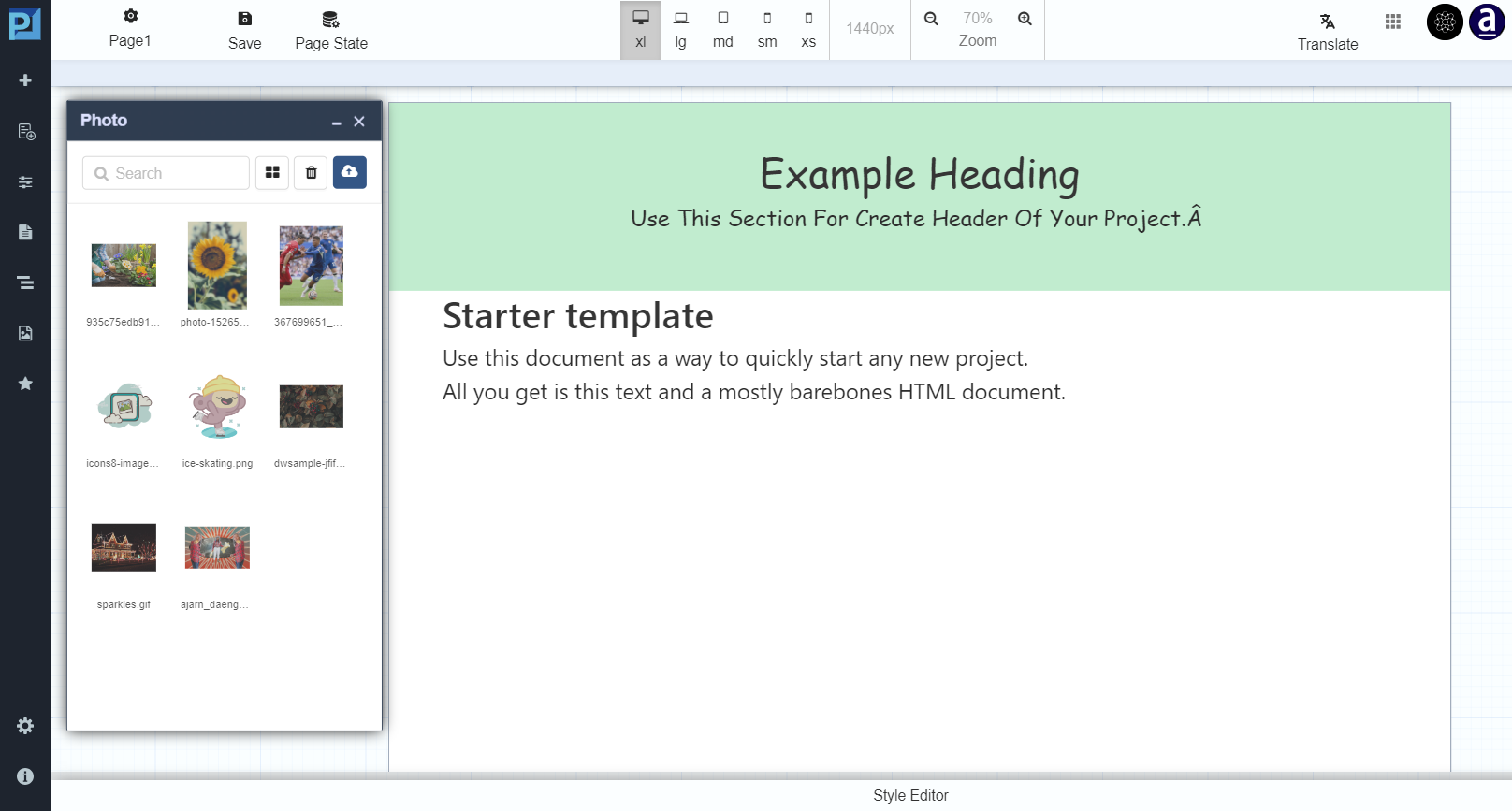
| Ico | Menu | Description |
|---|---|---|
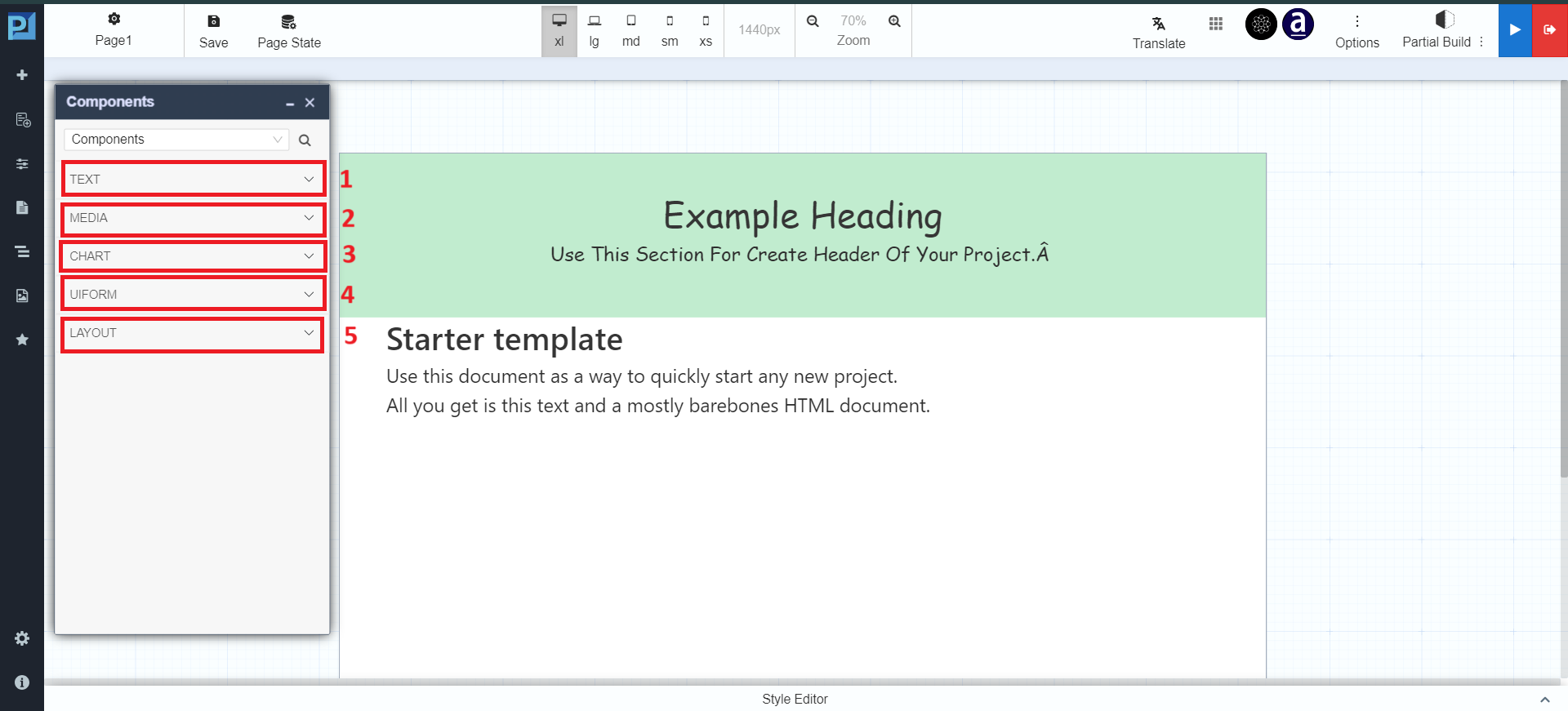
| Add Components | Add UI components to the page | |
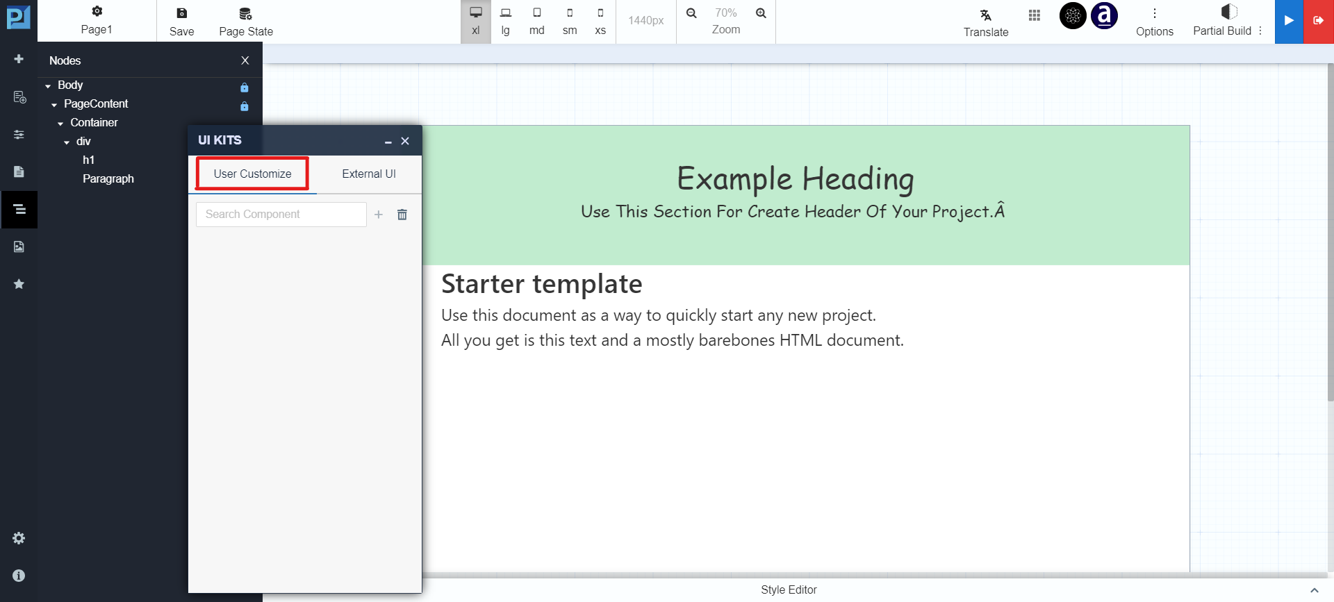
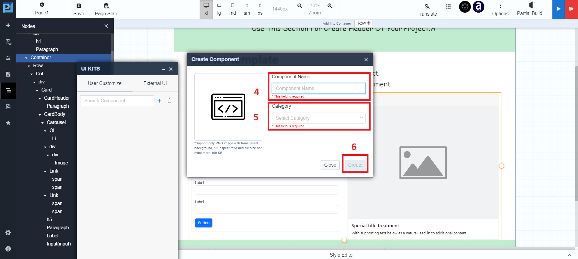
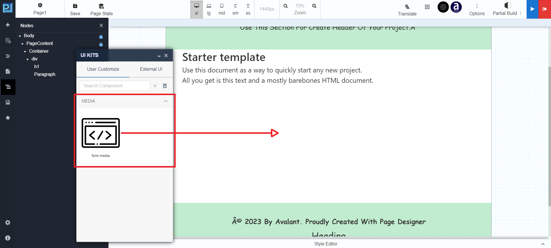
| UI Kits | Use reusable, custom, or external UI components |
| Open Tools | Configure logic, data flow, and behavior | |
| Pages | Manage pages within the application |
| Structure | View hierarchical structure of page layout |
| Upload Image | Upload and manage images | |
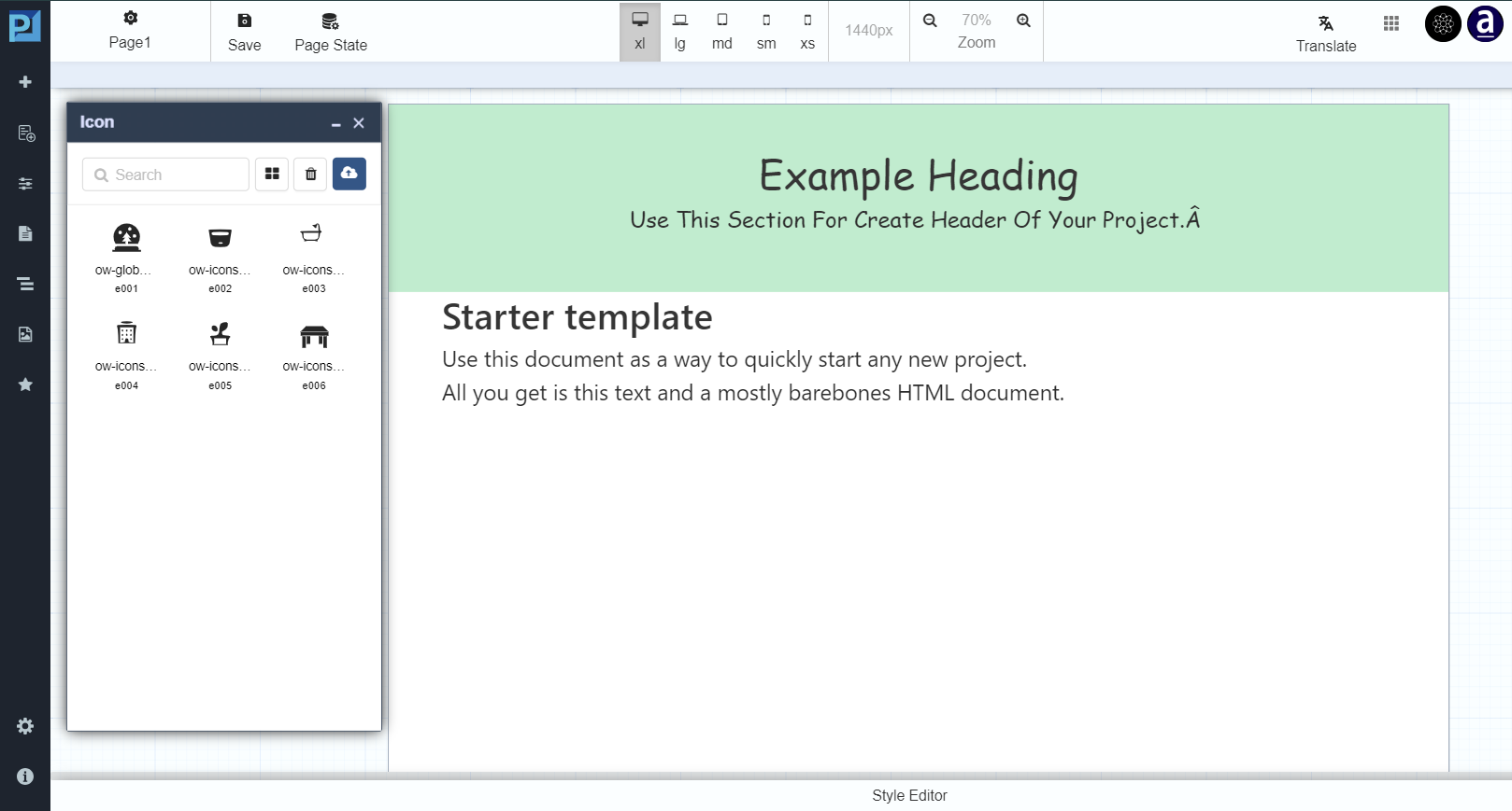
| Manage Icon | Upload and manage icons |