# Tabs
**Tabs** are used within an Entity to organize and present content in a clear, structured manner.\
They allow Smart Forms to handle **large volumes of data or multiple input sections** without creating a single, long, and complex form.
Using tabs improves usability by grouping related information into separate sections that users can navigate easily.
***
### Purpose of Tabs
Tabs are designed to:
* Divide large forms into logical sections
* Improve readability and user experience
* Allow users to focus on one section at a time
* Support forms where different sections have different structures
* Align UI design with underlying database relationships
Each tab is displayed independently, allowing users to navigate between sections using a **flat tab navigation structure**.
***
### Creating and Managing Tabs
In App Designer:
* Tabs can be **dragged and dropped** into an Entity
* An Entity can contain **multiple tabs**, based on design needs
* Each tab typically corresponds to a **logical or relational grouping** of data
* Tabs are usually designed according to the **database relationship structure**
There is no strict limit on the number of tabs, but good design practices are recommended to avoid over‑fragmentation.
***
### Tab Condition Feature
App Designer provides a powerful **Tab Condition** feature that allows tabs to be:
* **Enabled / Disabled**, or
* **Shown / Hidden**
based on the **value of a specific field** within the Smart Form.
This allows dynamic control over which tabs are visible to users at runtime.
#### Enabling Tab Condition
* Set **Tab Condition = `Y`** in the configuration
* Define the controlling field and its expected values
* Tabs will respond dynamically based on user input or data state
***
### Example: Conditional Tab Display
#### Business Scenario
A department offers **three service types**:
* `Hardware`
* `Software`
* `Hardware & Software`
The Smart Form has **two tabs**:
* **Hardware**
* **Software**
The requirement is to display tabs dynamically based on the selected service type.
***
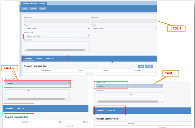
#### Tab Behavior by Case
* **Case 1**: Service Type = *Hardware & Software*\
→ Show both **Hardware** and **Software** tabs
* **Case 2**: Service Type = *Hardware*\
→ Show only the **Hardware** tab
* **Case 3**: Service Type = *Software*\
→ Show only the **Software** tab
***
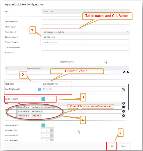
### Tab Condition Setup Configuration
In this example, **Service Type** is a field with three possible values.\
It can be configured using a **Dynamic List Box** field.
Below shows the Dynamic List Box configuration used to enable Tab Condition logic:
Based on these configurations, the Smart Form dynamically controls which tabs are visible.
***
### Output / Facade Screen Example
The following screenshots illustrate the Smart Form UI behavior for **Case 1, Case 2, and Case 3**:
{% hint style="info" %}
**Note**\
The screenshots demonstrate tab visibility for all three cases described above.
{% endhint %}
***
### Types of Tab Configuration
Currently, App Designer supports **two types of tab configurations**:
1. **Normal Tab**
* Single‑layer tab structure
* Suitable for simple or moderately complex forms
2. **2‑Layer Tab**
* Nested or hierarchical tab structure
* Suitable for complex forms with grouped sub‑sections
The choice between Normal Tab and 2‑Layer Tab depends on the complexity and hierarchy of the form design.
***
### Best Practices for Using Tabs
* Group related fields and modules within the same tab
* Avoid creating too many tabs unless necessary
* Use **Tab Condition** to simplify UI for users
* Align tab structure with business logic and DB design
* Test all conditional scenarios thoroughly
* Clearly name tabs to reflect their purpose
***
### Summary
**Tabs** are a core layout mechanism in App Designer that help structure Smart Forms effectively.
Key points:
* Tabs organize large or complex forms
* Support dynamic Enable/Disable and Show/Hide behavior
* Tab Condition allows rule‑based UI control
* Tabs can be Normal or 2‑Layer
* Improve usability and clarity of Smart Forms
When combined with **Tab Condition**, tabs enable **adaptive, data‑driven form layouts** that respond intelligently to user input and business rules.
---
# Agent Instructions: Querying This Documentation
If you need additional information that is not directly available in this page, you can query the documentation dynamically by asking a question.
Perform an HTTP GET request on the current page URL with the `ask` query parameter:
```
GET https://docs.onewebstack.com/oneweb-platform-th/designer-reference/app-designer/entity/create-new-entity/tabs.md?ask=
```
The question should be specific, self-contained, and written in natural language.
The response will contain a direct answer to the question and relevant excerpts and sources from the documentation.
Use this mechanism when the answer is not explicitly present in the current page, you need clarification or additional context, or you want to retrieve related documentation sections.