# Text Box
The **Text Box** field is a basic input component used to capture **short text or numeric values** from users.\
It is the most commonly used field type in Smart Forms and is suitable for single‑line input where the content length is relatively small.
Text Box fields can also be configured for **password input**, **number formatting**, and **validation rules**.
***
### Purpose of Text Box Field
The Text Box field is designed to:
* Capture short text input
* Accept numeric values
* Display password‑masked input
* Support formatting and validation rules
* Serve as the primary input field for most business data
#### Typical Use Cases
* Name fields
* Codes or identifiers
* Numeric quantities
* Email addresses
* Password entry
***
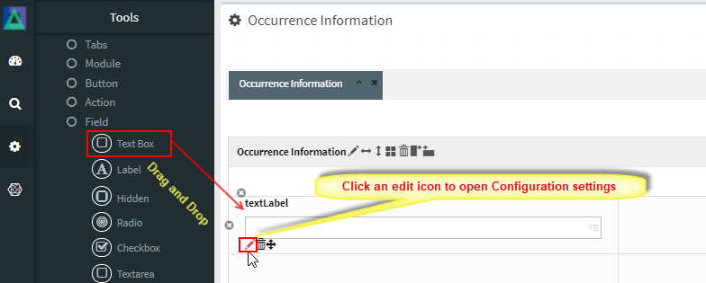
### Adding and Configuring a Text Box
To add a Text Box field:
1. Drag the **Text Box** field into a Module layout
2. Click the **Edit (pencil) icon** on the field
3. The **Text Box Configuration** window opens
***
### Text Box Configuration Properties
#### 1️. Core Identification
| Property | Mandatory | Description |
| --------- | --------- | ---------------------------------- |
| **MF ID** | Yes | System‑generated unique identifier |
***
#### 2️. Field Behavior & Appearance
| Property | Description |
| -------------------- | ---------------------------------------------------------------- |
| **Source Tag** | JavaScript injected at field level (e.g. `readonly`, `onchange`) |
| **Max Length** | Maximum content length to be stored (default: 20) |
| **Size** | Field width displayed on screen (default: 20) |
| **Password Flag** | Masks input characters for password entry |
| **Default Value** | Initial value displayed when form loads |
| **Number Formatter** | Formats numeric input: `Integer`, `Decimal`, or `Currency` |
***
#### 3️. Database Mapping
| Property | Description |
| ------------- | ------------------------------------ |
| **Field\_ID** | Database column mapped to this field |
***
#### 4️. Display & Search Configuration
| Property | Description |
| --------------------- | -------------------------------------------------------- |
| **ShowFieldName** | Label displayed on the screen (auto‑generated supported) |
| **SearchCriteria** | Enables field as search criterion |
| **ShowSearch** | Displays field in search result table |
| **SearchFromTo** | Enables range‑based search |
| **SearchPreLike** | Enables wildcard `%XXX` search |
| **SearchLike** | Enables wildcard `XXX%` search |
| **SearchIgnoreCase** | Enables case‑insensitive search |
| **JoinSearchTable** | Used when JOIN SQL is required |
| **SearchFieldGroup** | Horizontal position in search criteria |
| **SearchCriteriaSeq** | Vertical position in search criteria |
| **ShowSearchSeq** | Order in search results |
***
#### 5️. UI & Behavior Flags
| Property | Description |
| --------------- | ------------------------------------------- |
| **Alignment** | Text alignment: Left / Center / Right |
| **OnlyGuiFlag** | UI‑only field (not persisted into database) |
| **ViewFlag** | Displays field in read‑only mode |
| **KeepHistory** | Persists history of value changes |
| **FilterFlag** | Filters records in 1‑Many Modules |
| **Authen** | Applies IAM‑based authorization |
| **MergeFlag** | Field spans across multiple columns |
***
#### 6️. Validation Rules (Validate Code)
Validation logic applied before saving field data.
| Code | Description |
| -------------------- | -------------------------------- |
| `CHECK_NULL` | Prevents saving if value is null |
| `CHECK_INTEGER` | Ensures integer input |
| `CHECK_DECIMAL` | Ensures decimal input |
| `CHECK_EMAIL_FORMAT` | Validates email format |
***
### Usage Guidelines
* Use Text Box for **short, single‑line input**
* Use **Text Area** for long or multi‑line text
* Enable **Password Flag** for sensitive data
* Apply **Number Formatter** for numeric values
* Set appropriate `Max Length` to avoid data overflow
* Always use validation for critical fields
***
### Summary
The **Text Box** field is a core input component for capturing **single‑line text and numeric data** in ONEWEB Smart Forms.
Key points:
* Supports text, numeric, and password input
* Configurable formatting and validation
* Integrates with search and filtering
* Can be UI‑only or database‑persisted
* Most frequently used field type
When configured properly, Text Box fields provide a **simple, flexible, and reliable way** to capture essential business data.
---
# Agent Instructions: Querying This Documentation
If you need additional information that is not directly available in this page, you can query the documentation dynamically by asking a question.
Perform an HTTP GET request on the current page URL with the `ask` query parameter:
```
GET https://docs.onewebstack.com/designer-reference/app-designer/entity/create-new-entity/fields/text-box.md?ask=
```
The question should be specific, self-contained, and written in natural language.
The response will contain a direct answer to the question and relevant excerpts and sources from the documentation.
Use this mechanism when the answer is not explicitly present in the current page, you need clarification or additional context, or you want to retrieve related documentation sections.