# Checkbox
The **Checkbox** field is an input component used to allow users to **select one or more values** from a predefined list of options.\
Unlike the Radio field (single‑selection), the Checkbox field supports **multiple selections**.
Checkboxes are ideal for scenarios where users can choose **any combination** of available options.
***
### Purpose of Checkbox Field
The Checkbox field is commonly used to:
* Allow **multi‑selection** from a list
* Capture flags, features, or preferences
* Represent sets of independent options
* Improve data flexibility without complex UI
#### Typical Use Cases
* User preferences
* Feature selection
* Permission flags
* Agreement acknowledgements
* Category or tag selection
***
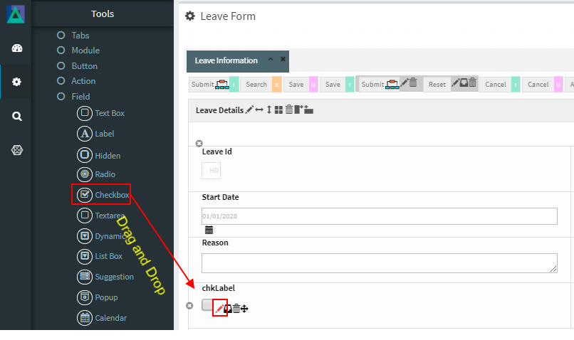
### Adding and Configuring a Checkbox Field
To add a Checkbox field:
1. Drag the **Checkbox** field into a Module layout
2. Click the **Edit (pencil) icon** on the field
3. The **Checkbox Configuration** window opens
***
### Checkbox Configuration Properties
#### 1️. Core Identification
| Property | Mandatory | Description |
| --------- | --------- | ---------------------------------- |
| **MF ID** | Yes | System‑generated unique identifier |
***
#### 2️. Checkbox Layout & Mode
| Property | Description |
| ---------------- | --------------------------------------------------------------- |
| **Tabular Type** | When enabled, displays checkbox options in a table‑style layout |
***
#### 3️. Checkbox Form Values (Option Definitions)
These properties define individual checkbox options.
| Property | Mandatory | Description |
| ----------------- | --------- | --------------------------------------- |
| **Value** | Yes | Stored value of the checkbox item |
| **ShowName** | Yes | Display text shown to the user |
| **Seq** | No | Display order of the option |
| **Default Check** | No | Marks the option as selected by default |
| **Source Tag** | No | JavaScript logic applied at item level |
***
#### 4️. Database Mapping
| Property | Description |
| ------------- | ------------------------------------ |
| **Field\_ID** | Database column mapped to this field |
> The Checkbox field may map to a column storing concatenated values or be handled via custom logic depending on schema design.
***
#### 5️. Display & Search Configuration
| Property | Description |
| --------------------- | ---------------------------------------------------- |
| **ShowFieldName** | Label displayed on screen (auto‑generated supported) |
| **SearchCriteria** | Enables field as search criteria |
| **ShowSearch** | Displays field in search result table |
| **SearchFromTo** | Enables range‑based search |
| **SearchPreLike** | Enables wildcard search `%XXX` |
| **SearchLike** | Enables wildcard search `XXX%` |
| **SearchIgnoreCase** | Case‑insensitive search |
| **JoinSearchTable** | Used when JOIN SQL is required |
| **SearchFieldGroup** | Horizontal grouping in search criteria |
| **SearchCriteriaSeq** | Vertical position in search criteria |
| **ShowSearchSeq** | Order in search results |
***
#### 6️. UI & Behavior Flags
| Property | Description |
| --------------- | ------------------------------------- |
| **Alignment** | Text alignment: Left / Center / Right |
| **OnlyGuiFlag** | UI‑only field (not persisted in DB) |
| **ViewFlag** | Displays field in read‑only mode |
| **KeepHistory** | Persists history of value changes |
| **FilterFlag** | Filters records in 1‑Many Modules |
| **Authen** | Applies IAM‑based authorization |
| **MergeFlag** | Field spans across multiple columns |
***
#### 7️. Validation Rules (Validate Code)
Validation logic applied before saving data.
| Code | Description |
| -------------------- | -------------------------------- |
| `CHECK_NULL` | Prevents saving if value is null |
| `CHECK_INTEGER` | Ensures integer value |
| `CHECK_DECIMAL` | Ensures decimal value |
| `CHECK_EMAIL_FORMAT` | Validates email format |
***
### Usage Guidelines
* Use Checkbox when **multiple selections are allowed**
* Avoid using for mutually exclusive choices (use Radio instead)
* Define clear `ShowName` labels for each option
* Set `Default Check` thoughtfully to avoid confusion
* Consider database design when persisting multiple values
* Use `FilterFlag` carefully in 1‑Many Modules
***
### Summary
The **Checkbox** field enables flexible **multi‑selection input** in ONEWEB Smart Forms.
Key points:
* Supports selecting **multiple values**
* Configurable option list with display order
* Rich support for search, filtering, and validation
* Integrates with IAM authorization
* Can be UI‑only or database‑persisted
Used correctly, Checkbox fields provide a **powerful and user‑friendly way** to capture multiple related choices while maintaining clean data structures.
---
# Agent Instructions: Querying This Documentation
If you need additional information that is not directly available in this page, you can query the documentation dynamically by asking a question.
Perform an HTTP GET request on the current page URL with the `ask` query parameter:
```
GET https://docs.onewebstack.com/designer-reference/app-designer/entity/create-new-entity/fields/checkbox.md?ask=
```
The question should be specific, self-contained, and written in natural language.
The response will contain a direct answer to the question and relevant excerpts and sources from the documentation.
Use this mechanism when the answer is not explicitly present in the current page, you need clarification or additional context, or you want to retrieve related documentation sections.